Midnight Merlot: The Poetry of PR177
Some colors whisper. Others sing.
And then there are colors like Midnight Merlot, a deep burgundy red that seems to carry entire stories within its shadows.
When I first brush Midnight Merlot across paper, I am reminded of velvet petals unfolding in evening light, of rich red wine shared among friends, and of gardens lingering long after the sun has disappeared below the horizon. It is a color that feels both dramatic and elegant, bold yet thoughtful.
Colors Used
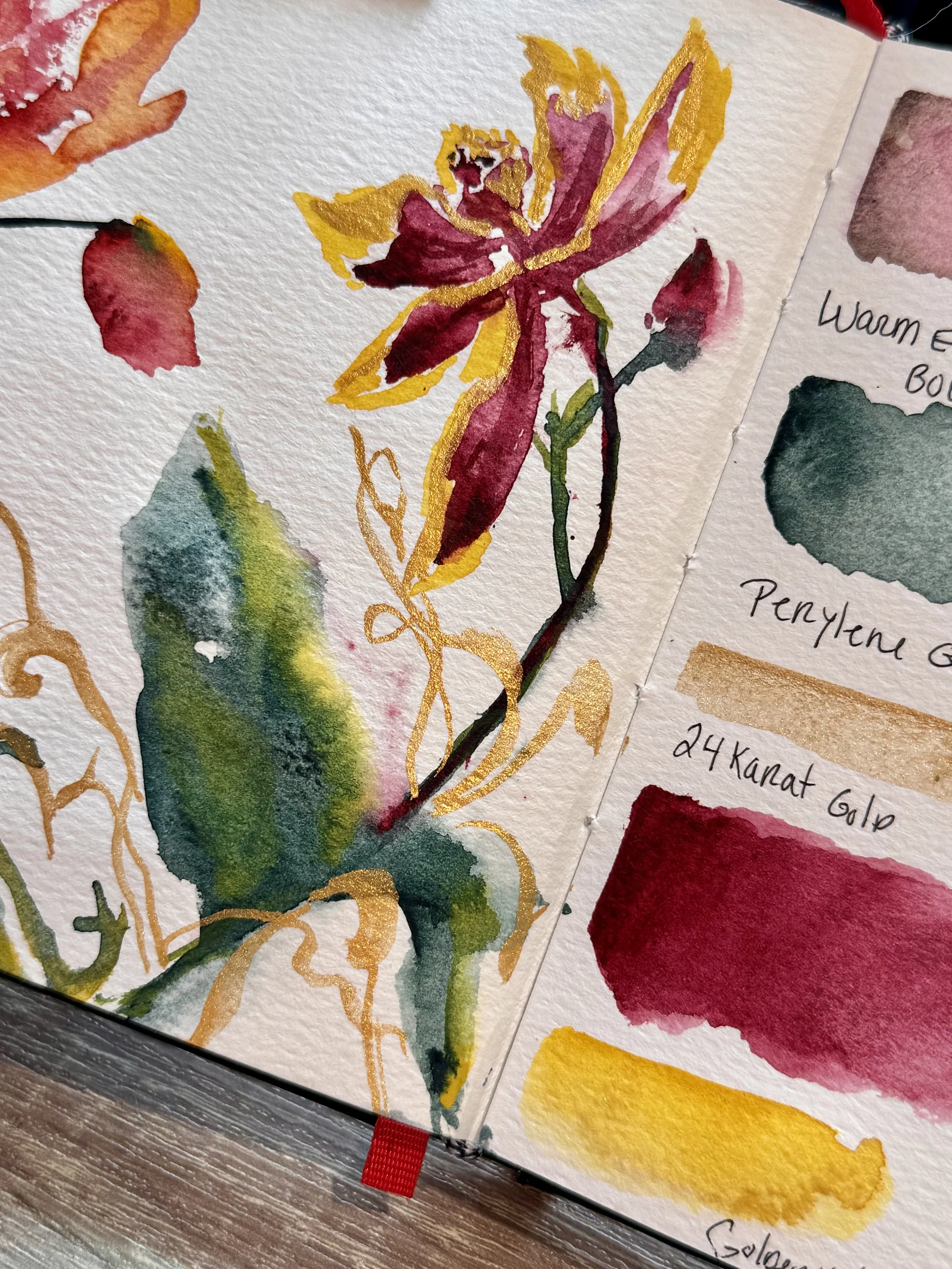
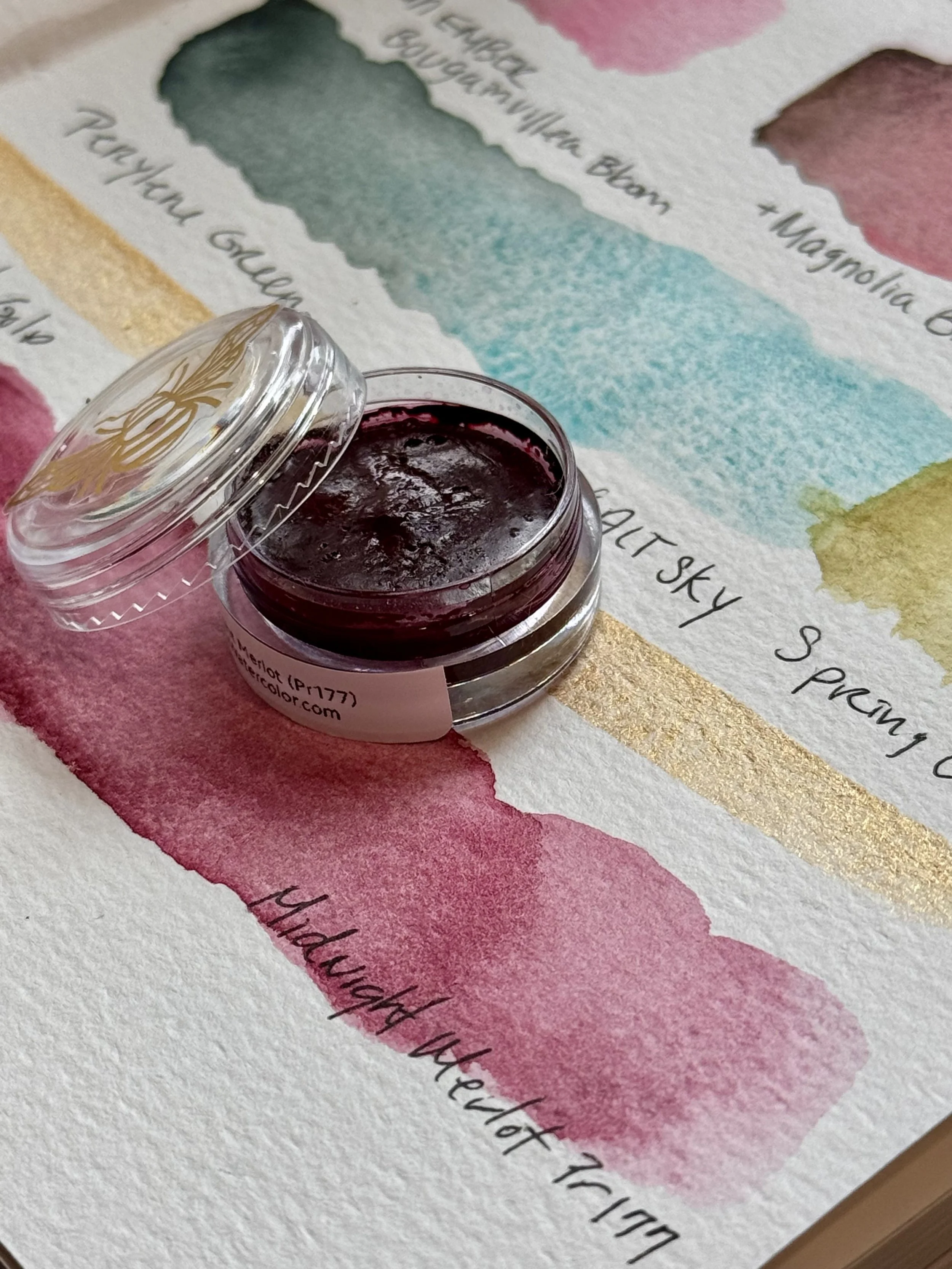
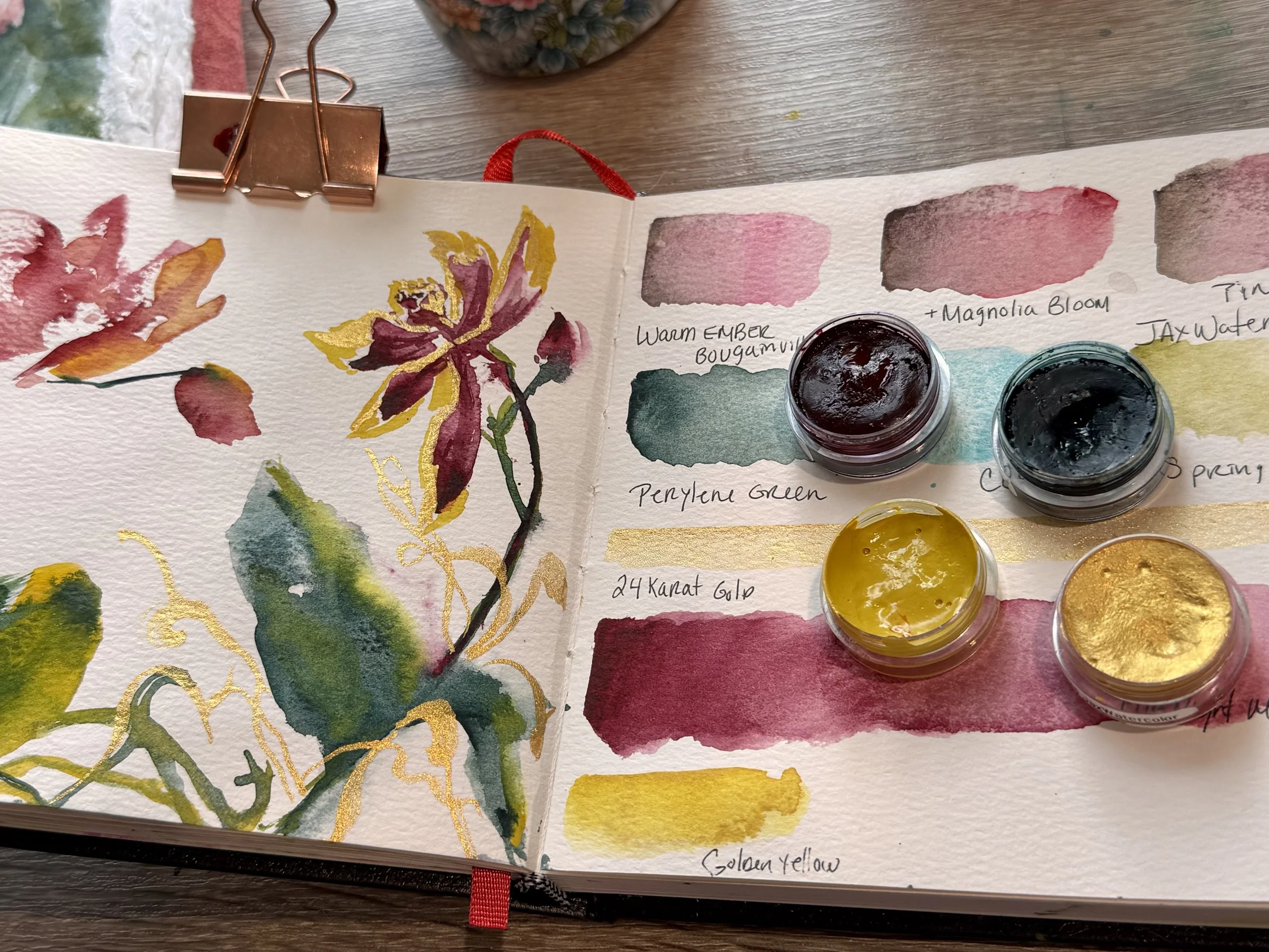
Midnight Merlot (PR177)
Perylene Green
Golden Yellow
24 Karat Gold Metallic
All handcrafted by Jax Watercolor using professional-grade pigments and our signature honey-based watercolor formula. Shop Honey Watercolor Pots
The Story Behind PR177
Midnight Merlot is crafted from Pigment Red 177 (PR177), known chemically as Anthraquinone Red.
PR177 belongs to the anthraquinone family of pigments, a group celebrated for producing deep, transparent reds with exceptional richness. Unlike many brighter, more opaque reds, PR177 offers artists something a little more mysterious. It creates beautiful transparent layers, allowing light to travel through the pigment and reflect back through the paper, giving paintings a sense of depth and luminosity.
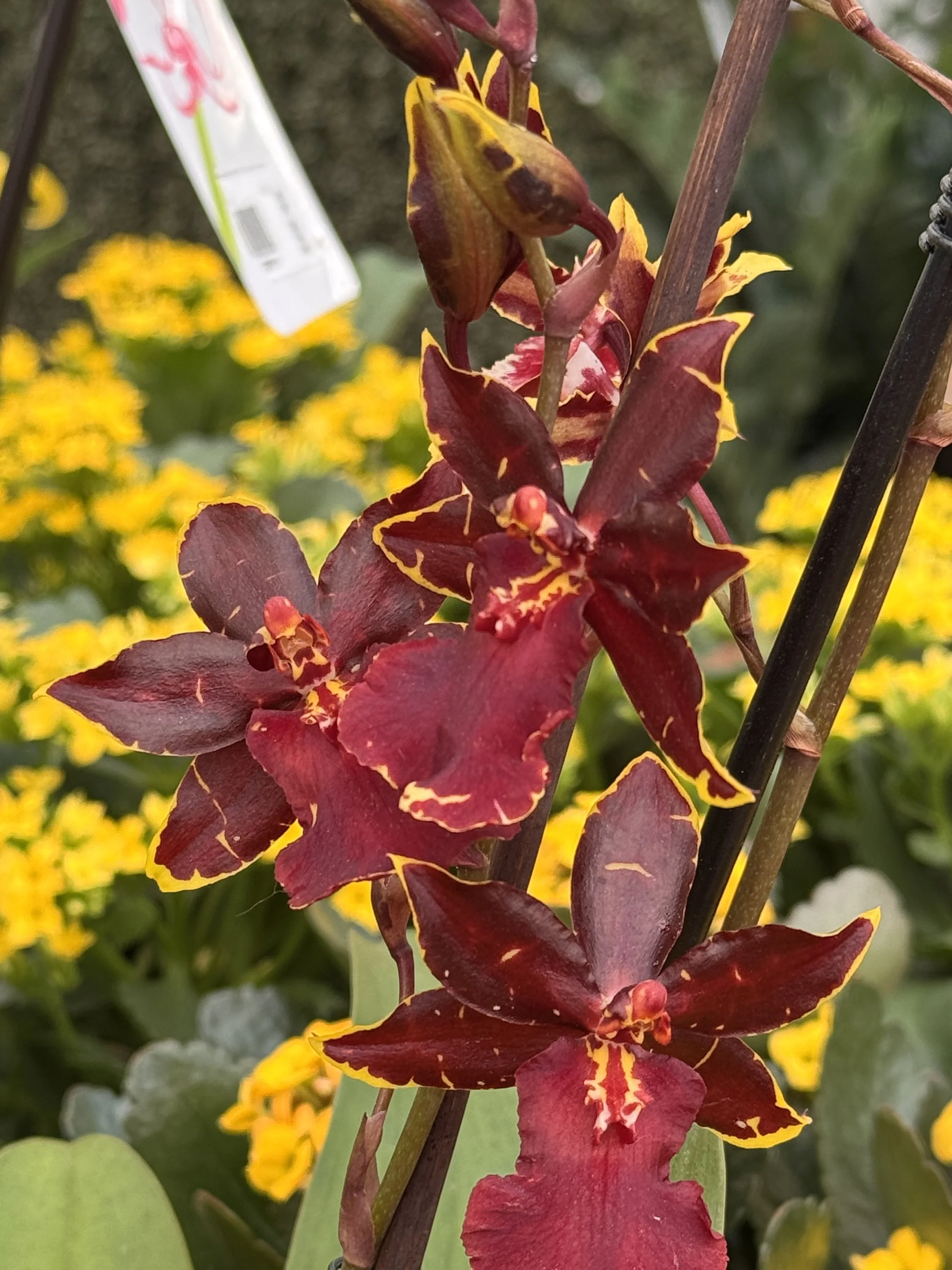
One of the most fascinating qualities of PR177 is its versatility. At full strength, it can appear as a luxurious wine-red or burgundy. Diluted with water, it reveals softer rose and raspberry undertones that feel almost floral in nature. This ability to move between strength and delicacy makes it especially appealing for botanical artists.
Pigment availability has changed over the years, making PR177 increasingly appreciated among watercolor enthusiasts who value unique single-pigment colors. Artists often seek it out for its transparent nature, strong tinting strength, and ability to create rich darks when mixed with greens and blues.
A Color Story Inspired by Nature
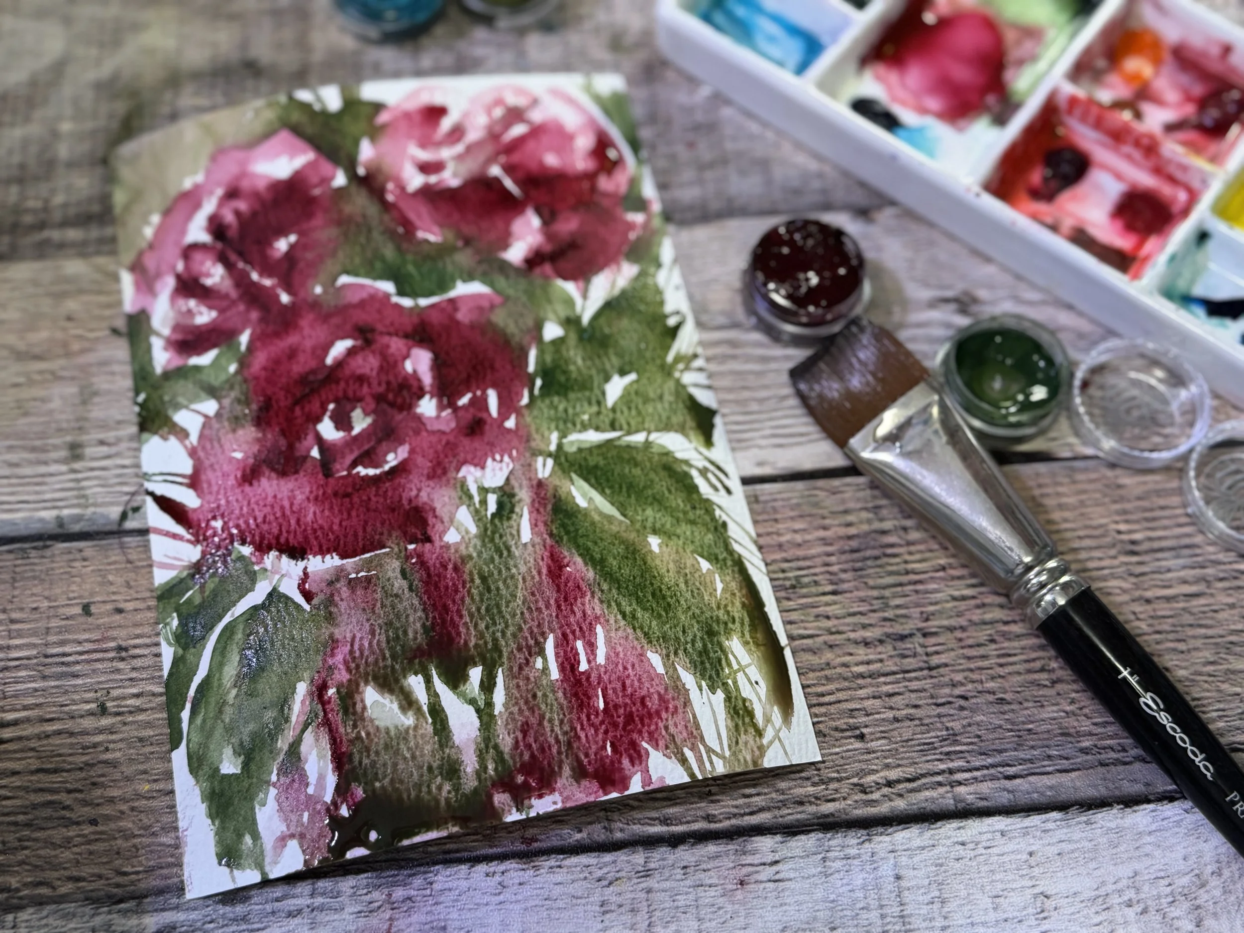
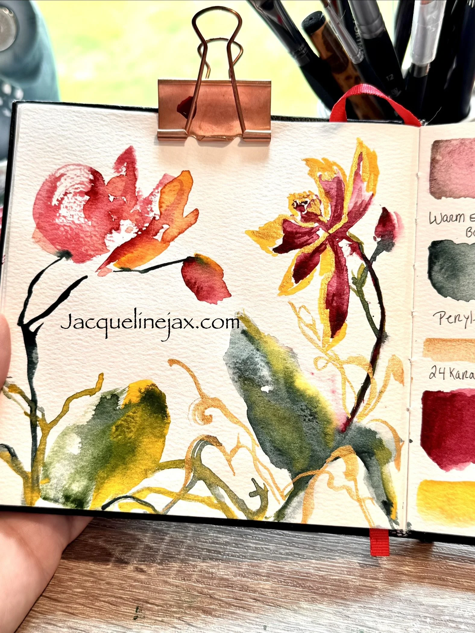
For this orchid painting, Midnight Merlot became the star of a carefully chosen palette.
I paired it with Perylene Green, a beautifully deep and earthy green that creates striking contrast against the burgundy petals. Together they feel as though they belong in a conservatory filled with rare tropical plants.
To bring warmth and light into the composition, I introduced Golden Yellow, allowing golden highlights to dance among the shadows. The yellow softens the drama of the burgundy while creating a sense of sunlight filtering through leaves.
Finally, touches of 24 Karat Gold Metallic transformed the painting into something almost jewel-like. The metallic gold catches the light and creates moments of sparkle, elevating the orchids from a simple botanical study into something that feels luxurious and celebratory.
Together these four colors tell a story of contrast:
Deep shadow and glowing light.
Rich earth and precious metal.
Bold color and delicate petals.
For today’s painting, I chose orchids as my subject. Orchids have a quiet sophistication that pairs beautifully with the depth and complexity of this remarkable pigment. Their graceful curves and luminous petals seemed the perfect stage for Midnight Merlot to reveal its character.
Why Artists Love Midnight Merlot
As watercolor artists, we’re often searching for colors that do more than simply fill a shape. We want pigments that contribute mood, atmosphere, and emotion.
Midnight Merlot does exactly that.
It creates dramatic florals without becoming overpowering. It layers beautifully for glazing techniques. It mixes into rich, sophisticated neutrals. Most importantly, it carries a sense of elegance that is difficult to find in brighter reds.
Whether you’re painting roses, orchids, autumn botanicals, berries, or moody florals, Midnight Merlot invites you to slow down and explore the subtle beauty hidden within its layers.
Like the finest gardens, its beauty isn’t revealed all at once.
It unfolds slowly, one transparent wash at a time.